• Welcome to the Devil May Cry Community Forum!

    We're a group of fans who are passionate about the Devil May Cry series and video gaming.

    Register Log in

New Sigs/Artwork

NerosDevil

Shall we dance?
Mostly what BOC said. I've actually learnt not to use brushes anymore, unless you could use them for the smudge tool or eraser tool to make the erased part blend in more and less clean-cut.
I actually tried to make the Leon tag have some perspective about it, bluring on Leon's back and leading outwards to the rocker launcher and sharpening the front, adding some lighting with a soft brush on his hair, the launcher and etc I also tried using Umbrella corp colours which match RE. Red, white...bits of blue.
The text is also a bit cheap, smaller text, placed in more conviniant areas has more appeal, you want the person to focus on the sig not the text. Mines kinda plain but you can see the focus between the N and D going outwards. It kinda sucks since i finished watching Degeneration at 4 in the morning and i'll probably edit the sig later XD
CS3 you need to learn how everything works, then even having professional tuts seems easy.
I'm still not where I want to be with sigs but eh....all takes time.
Also, I like your new sig BOC ^ ^
 

Pantera Queen

Well-known Member
BringerOfChaos;152854 said:
^I can critique that.:p

I'm no professional at text but you use far too much of it.
Just put "C.C." there, but in a smaller size.

When I was starting out my stuff was usually monotonous, and it sometimes still is, so when doing monotone tags makes sure the color you choose isn't a vibrant color.

If you wanna blend the render smudge and erase it.

Now for render choosing. When you choose a render or even a stock make sure the image you selected has something dynamic about it.
For example my jo tag or ND's Leon tag.
In ND's tag Leon looks as if he's ducking something and has pressing the rocket launcher to his side.
Examine that image and tell me do you see any hopes of flow happening.

Now for my Jo tag.
Jo is flailing her arms, gun-in-hand as if readying herself to shoot something.
These kinds of images are more interesting to look at rather than images of a person just standing there.


This is one of my tags from the recent past.

When using brushes don't over do it, and don't let them destroy flow.
I personally don't use brushes.:p

23lhamh.jpg


Make sure certain parts are darker, because it helps create a focal.
And as far as Back grounds I'd suggest you use a image rather than a solid color.

And for the record I see you like to render.
Look at these:

333dh0z.jpg


2dtvd3q.jpg


2b6x7c.jpg

Also your tags are kinda blurry! SHARPEN!!!!!!!!!xD


Notice the similarities?


Wow!!! You tearin' my crap up!!!>_<

I get you mean. So I should pick an image where the person or character has some action going on. Yours and ND's choice of pics does have more flow.

Other than a solid color an image. Like buildings,beaches,castles,etc.?

Blurriness was one of my problems.

Thanks BoC. I appreciated your advice. I'll come up with something awesome^_^

EDIT

Would someone rockin on a guitar be considered dynamic?


@NerosDevil

Text has always been my problems. Anyway thanks guys.
 

NerosDevil

Shall we dance?
Well...it's not really up to others 'how' something flows, its how you make it flow being creative. When im choosing renders, i pick something that can be dynamic, if it someone with a guitar, depends on the pose of it. Like BOC said...you don't want someone just standing there looking dull.
 

-B.(o).C-®

涼宮ハルヒの憂鬱 SOS団
^Thanks ND.^^


If you wanna know how I make something just ask and I'll either give the psd., or if I don't have it I'll tell you Verdice.
 

Sicktress

Artist
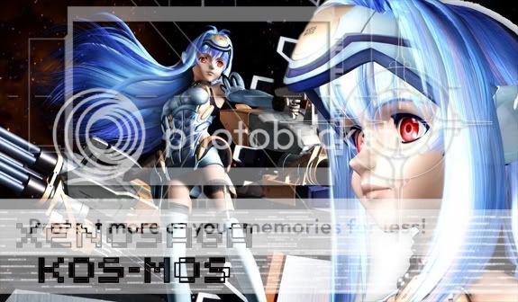
Ok I finally made a new one.
It only took about 5 minutes, critiques are ok but I was just getting tired of the DMC sig.

xenosig.jpg


Used CS3
 

-B.(o).C-®

涼宮ハルヒの憂鬱 SOS団
Sicktress;152881 said:
Ok I finally made a new one.
It only took about 5 minutes, critiques are ok but I was just getting tired of the DMC sig.

xenosig.jpg


Used CS3
Did you use brushes?
 

Sicktress

Artist
Yep brushes for the techy stuff around her eyes and the frame one. And I made sure it was exactly 575 pixels wide, which is the maximum now. Time to work on a new sig! Hmm I'm thinking Bleach inspired..

Brushes are my biggest thing because I'm sooooo lazy. The extent of my Photoshop work is in retouching images mainly, and editing hand drawn images by adding color. But brushes and texts, those are my two favorite tools. I'm not big on blur, maybe motion blur and smart blur and very little blending modes, but nothing too fancy. This is one of my favorite dmc sigs, even though it clearly has flaws:

neromozaic1.jpg


This one is one of my favorites, even though I kind of hate Fall Out Boy now, made on Illustrator:

fobletsgo.jpg
 

-B.(o).C-®

涼宮ハルヒの憂鬱 SOS団
Sicktress;153078 said:
Yep brushes for the techy stuff around her eyes and the frame one. And I made sure it was exactly 575 pixels wide, which is the maximum now. Time to work on a new sig! Hmm I'm thinking Bleach inspired..

Brushes are my biggest thing because I'm sooooo lazy. The extent of my Photoshop work is in retouching images mainly, and editing hand drawn images by adding color. But brushes and texts, those are my two favorite tools. I'm not big on blur, maybe motion blur and smart blur and very little blending modes, but nothing too fancy. This is one of my favorite dmc sigs, even though it clearly has flaws:

neromozaic1.jpg


This one is one of my favorites, even though I kind of hate Fall Out Boy now, made on Illustrator:

fobletsgo.jpg
That multi-image tag must've have taken forever. o_O
 

Sicktress

Artist
It did, all the loading and resizing, each image was batch reduced to very small size, but the batch saved a lot of time. All you have to do record the action of resizing just one. Then pick the folder where all the photos you want are sitting, and do them all at once (File>Automate>Batch, then select the action to resize). Once they're all resized, Go back to File>Automate>Contact Sheets and make a huge contact sheet of all the images in the folder with the resized pics (make sure you dupplicate them, once they're resize they can't un-resize). When making the contact sheet, uncheck "Use Auto Spacing" and change the spaces to 0 pixels, as to not create any borders. And voila! Paste it into your main big images, then change the blending modes to your liking!
 

-B.(o).C-®

涼宮ハルヒの憂鬱 SOS団
Sounds complicated.

But speaking from experience photoshop always sounds more complicated than it actually is.
 

Sicktress

Artist
I love Uryu and Bleach! But critique time, the font doesn't quite fit in, this is your tag I'm guessing? Try to make it blend in more, it kind of detracts from the image when it's all bold-ed and separated like that. Also, what is the focal point and overall theme? Both Ichigo and Uryu are on the same dimension yet they're not tied in by anything in particular, only color. I also see some traces of Uryu in the back, his arm, kind of throws it all off balance.
 

Pantera Queen

Well-known Member
Sicktress;153324 said:
I love Uryu and Bleach! But critique time, the font doesn't quite fit in, this is your tag I'm guessing? Try to make it blend in more, it kind of detracts from the image when it's all bold-ed and separated like that. Also, what is the focal point and overall theme? Both Ichigo and Uryu are on the same dimension yet they're not tied in by anything in particular, only color. I also see some traces of Uryu in the back, his arm, kind of throws it all off balance.


*sighs*

What exactly is a focal point?

The overall theme is to show how cool Uryu and Ichigo are but I guess that didn't work out. I thought having fading images would help the background. I know the fonts sucks. I appreciate the critique. It's nessacary for me to get better.
 

-B.(o).C-®

涼宮ハルヒの憂鬱 SOS団
Hold your finger in front of your face.
Now focus on it.

Do you notice how everything behind it blurs?
That's a focal point.
Feel free to ask me anything.
 
Top Bottom