You are using an out of date browser. It may not display this or other websites correctly.
You should upgrade or use an alternative browser.
You should upgrade or use an alternative browser.
I've been drawing a custom devil trigger.
- Thread starter peppycat
- Start date
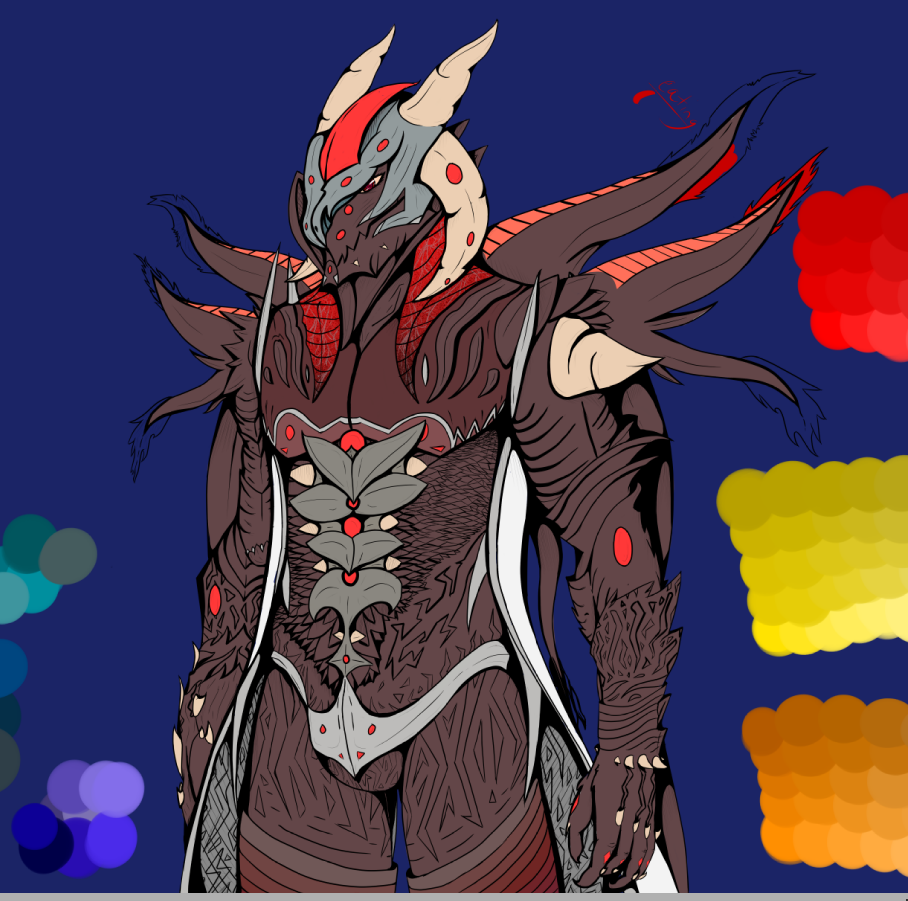
Holy... that is actually very, very cool. Really amazing detail. My only really -- very noobish suggestion -- would be to perhaps include some of Vergil's signature baby blue into the design. That's all I've got, really. This is probably a trillion times better than anything I could conjure up so final rating IGN/10 would read again.
Koschei
Well-known Member
First of all, it's overall a very good drawing. The proportions are correct, lines are confident, there is a nice amount of detail, while it stills remains readable. Of course, there is always a room for improvement. Here's what I think could be better, feel free to disagree:
Artistically:
First - depending on a purpose of this drawing, it could benefit from a more dynamic pose. The one presented is kinda boring, which is fine if the drawing is supposed to just present a design, but less fine if it's supposed to be a standalone work. Second - it could definitely use more shading, right now, it's very flat.
Thematically:
I'm not the biggest DMC nerd, so I may be wrong, but there are two things I find questionable. First - it doesn't clearly convey whose DT it is. I thought it's Dante (because of the red dots, which in my opinion are not the best idea), Steve apparently thought it's Vergil? If I'm correct, apart from DMC1, all DT were very clearly red/blue, to fit the character. I think brown is too neuter. Unless that's what you were going for, but in this case, it requires explanation. Second - I'm not sure about the reptile face. I think DT's heads are usually rather antropomorphic. Of course you can make it whatever you want, but I feel like reptiles are a little cliche, and don't fit well with how devil triggers usually look like.
Oh, and also, I'd make his crotch bigger, it looks like he's been castrated")
Artistically:
First - depending on a purpose of this drawing, it could benefit from a more dynamic pose. The one presented is kinda boring, which is fine if the drawing is supposed to just present a design, but less fine if it's supposed to be a standalone work. Second - it could definitely use more shading, right now, it's very flat.
Thematically:
I'm not the biggest DMC nerd, so I may be wrong, but there are two things I find questionable. First - it doesn't clearly convey whose DT it is. I thought it's Dante (because of the red dots, which in my opinion are not the best idea), Steve apparently thought it's Vergil? If I'm correct, apart from DMC1, all DT were very clearly red/blue, to fit the character. I think brown is too neuter. Unless that's what you were going for, but in this case, it requires explanation. Second - I'm not sure about the reptile face. I think DT's heads are usually rather antropomorphic. Of course you can make it whatever you want, but I feel like reptiles are a little cliche, and don't fit well with how devil triggers usually look like.
Oh, and also, I'd make his crotch bigger, it looks like he's been castrated
peppycat
whats up gamers, lets get that bread
Holy... that is actually very, very cool. Really amazing detail. My only really -- very noobish suggestion -- would be to perhaps include some of Vergil's signature baby blue into the design. That's all I've got, really. This is probably a trillion times better than anything I could conjure up so final rating IGN/10 would read again.
That's not a noobish suggestion at all! I should, I feel like a tad bit of blue in it would fare well in contrast with the design colors, and maybe make the light shining in the trigger be cerulean sort of blue as well.
First of all, it's overall a very good drawing. The proportions are correct, lines are confident, there is a nice amount of detail, while it stills remains readable. Of course, there is always a room for improvement. Here's what I think could be better, feel free to disagree:
Artistically:
First - depending on a purpose of this drawing, it could benefit from a more dynamic pose. The one presented is kinda boring, which is fine if the drawing is supposed to just present a design, but less fine if it's supposed to be a standalone work. Second - it could definitely use more shading, right now, it's very flat.
Thematically:
I'm not the biggest DMC nerd, so I may be wrong, but there are two things I find questionable. First - it doesn't clearly convey whose DT it is. I thought it's Dante (because of the red dots, which in my opinion are not the best idea), Steve apparently thought it's Vergil? If I'm correct, apart from DMC1, all DT were very clearly red/blue, to fit the character. I think brown is too neuter. Unless that's what you were going for, but in this case, it requires explanation. Second - I'm not sure about the reptile face. I think DT's heads are usually rather antropomorphic. Of course you can make it whatever you want, but I feel like reptiles are a little cliche, and don't fit well with how devil triggers usually look like.
Oh, and also, I'd make his crotch bigger, it looks like he's been castrated
Thank you for the informative reply! I do rather appreciate it.
In reply to the first artistic reasons; The art is meant to be used as a character sheet and most of the character sheets I have seen usually result with the characters arm down to their sides, or using four different views of the character (which, I will do eventually) but this was mostly just to put my ideas down design-wise rather than have to explain my trigger through words. I do agree that it's a bit flat and needs more shading, but this was as said just to preview a design with color scheme and if the design is good.
In reply to the second thematically reasons; It is based off of Dante but it is not for either character or Nero. It's for an original character that I've been using since 2013 named Vitalitas Ruoxach (or, Vitaly Zaikov in his original birth name.) In the concept art for Nero, his "real trigger" was a royal purple much like Sparda's original trigger, but Vitalitas is not related to Sparda or kin to any (unless there is deeper "demonic families" much like Sparda, which in this case Vitalitas would be from one of those instead of being an artificial experiment like Credo,) I was going for more of a saturated red rather than a bright and obnoxious one, but I should probably go for a better color scheme in the sense of "who's family is he from?" And "is he a strong half demon?"
On the statement about the reptilian features, I always had this theory that when a trigger is enveloped it's colder in emotion rather than feature, so I decided to switch that around. The scales are more chainmail than anything, able to flatten and flex much like a cat's pelt (as in if they are stretching) and mostly give the demon a shielded ribcage area
Also, yes, I will make him have a bigger nutsack! Thank you very much for your reply and I enjoyed making my reply myself and I will be sure to improve on shading and design!
I love your signature, by the way! Love me some nude Dante, xaxaxaxaxa
Solar the rabbit
Well-known Member
This is really cool! This look like DmC Dante complete devil trigger.
Also I wish I could draw as good as you.
Also I wish I could draw as good as you.
I have no idea why I thought it was Vergil... hmm. My bad! As a Dante DT - absolutely flawless in my eyes. I studied renaissance art in my first year of university... but I've forgotten pretty much everything to do with critical analysis. I want to say... painterly but that's only because it is literally the only terminology that I can remember.
Now do Vergil so I can pretend that that's the one I was... reviewing.
Now do Vergil so I can pretend that that's the one I was... reviewing.